
LESSON 24 · ARTRAGE 6
Watercolour, Pencils & Inks
Oils sit on top of the canvas. Dry media dig into it, and watercolour sinks into it. All three are driven by the same thing — the grain of the surface you chose in L22 — which is why the same pencil can look like a soft graphite smudge on one canvas and a scratchy conte line on another. This lesson covers pencil, ink and watercolour, and how to combine them in one painting.
45 min
TIME
Intermediate
LEVEL
ArtRage 6
SOFTWARE
What you'll learn
Predict how canvas grain will change a pencil, ink or watercolour stroke
Use pressure and tilt with the pencil to get line weight and broad shading
Ink clean, confident line art with the Ink Pen
Lay flat colour under line art with the Fill tool
Build a watercolour wash in transparent passes instead of one heavy layer
Before you start
Finish first: L6, L22, L23
- Your L22 grain reference sheet open for comparison
- A pencil drawing of your own you would like to ink and colour
- Artist 12 connected, and your L3 pressure curve in place
WATCH
Watch this first
Pencil Tool Settings & Tips
Ambient Design — The developers walking through the pencil's own settings — worth more than any third-party guess.
Drawing & Coloring Line Art in ArtRage
Ambient Design — A complete line-art-to-colour run in one sitting, which is exactly this lesson's practice.
ArtRage Lines & Color Part 6: Fill Tool
Ambient Design — Flatting a drawing by hand is slow. This is the fast, correct way to do it.
THE LESSON
Grain is the engine of dry media
With the Oil Brush, the canvas texture is one influence among several. With pencils, chalks and anything else that drags across the surface, grain is the whole story. A dry mark is made where the tool touches the raised parts of the tooth and skipped where the surface dips. Coarse grain gives you a broken, gritty line; fine grain gives you a smooth, dense one. Nothing about the tool changed.
So the first decision in a drawing-led piece is not which pencil to use, it is which canvas to draw on. Go back to your L22 test sheet and look at how the same stroke behaved on each surface. And remember the rule from that lesson: changing the canvas later does not touch paint already on it, so the surface has to be right before you start.
Watercolour uses the same surface differently. Rather than skipping over the grain, thin colour runs into it and settles in the low points, which is why a wash on a coarse canvas looks granular and one on a smooth canvas looks even.
The pencil: pressure, tilt and restraint
Your X4 stylus reports 16,384 levels of pressure and 60 degrees of tilt, and the pencil is where you will feel both most clearly. Pressure does the obvious job — light for construction lines, heavy for the lines you mean. Tilt is the part people never test: lay the pen over toward the canvas instead of holding it upright, and see how the stroke changes. That is the digital equivalent of using the side of the lead rather than the point, and it is how you shade an area quickly without hatching every millimetre of it.
The pencil has its own settings panel, and rather than list sliders here, spend five minutes with the Ambient Design video above and change one setting at a time on a scrap canvas. That habit — one change, one test stroke, look — is worth more than memorising any panel.
One piece of technique carries straight over from L6: draw from the elbow, not the fingers, and let pressure rather than repetition build the line. Digital pencils reward a single confident stroke and punish twenty nervous ones, exactly like real ones.
Ink, and the flats underneath
The Ink Pen gives you the opposite of the pencil: flat, dense, hard-edged line with none of the surface breaking through. That is what you want for line art you intend to colour, because a clean closed shape is what makes the next step possible. Work on a dedicated layer, keep your pencil drawing on a layer underneath at reduced opacity, and ink over it.
Line weight is what makes ink look professional. Thicker lines on the shadow side and on the outer silhouette, thinner lines inside the form and on lit edges. That single rule does most of the work.
Once the line art is closed, the Fill tool puts flat colour down in one click per shape. Put the flats on a layer beneath your ink, not above it, so the line stays crisp. If the Fill leaks out into the background, you have a gap in your line — find it and close it rather than fighting the fill. Ambient Design's Fill Tool video shows the settings that control how far a fill spreads into a soft edge.
Watercolour: transparent, patient, in passes
Watercolour is the tool that punishes hurry. It works in transparent passes: each wash you lay lets the one underneath show through, so the colour builds up gradually and the paper — or in this case the canvas — supplies the lightest value. Plan your lights as the areas you simply leave alone.
Work light to dark, and let a wash settle before you cross it, exactly as you would on paper. Wet colour meeting wet colour will bleed and mingle, which is either the best thing about the medium or a mess, depending entirely on whether you meant it. Keep separate washes on separate layers while you are learning, so a bad pass costs you one layer rather than the painting.
Combining all three is the classic workflow and the point of the practice below: pencil construction underneath, ink over the top, flats from the Fill tool, and watercolour washes to give the flats life. Save the whole thing as a .ptg — layers, wetness and all — before you export anything.
Which version you are using
This lesson describes ArtRage 6, which Ambient Design no longer sells; the current products are ArtRage Vitae and ArtRage Lite. The ideas here — grain driving dry media, transparent watercolour passes, flats under line art — do not change between versions, but panel names and layouts may. If something is not where this page says, check the manual wiki for the version you are running before assuming it has gone.
PRACTICE · 45 MIN
Pencil, ink, flats, wash
- Open L24-ink-wash-template.ptg. It has four layers already named and stacked in the right order.
- On the 'Pencil' layer, draw a simple subject in construction lines: a boot, a teapot, a bird. Ten minutes, no more.
- Drop that layer's opacity to about 30 per cent.
- On the 'Ink' layer, ink the drawing with the Ink Pen. Deliberately vary line weight: heavier on the shadow side and the outer silhouette.
- Check every shape you intend to fill is fully closed. Zoom in on the joins.
- On the 'Flats' layer, beneath the ink, use the Fill tool to lay one flat colour per shape from your L22 colour collection.
- On the 'Wash' layer, add watercolour over the flats in two passes, letting the first settle before the second. Leave your lightest areas untouched.
- Hide the 'Pencil' layer.
- Save as .ptg first, then export a PNG alongside it.
Done when: A finished ink-and-wash drawing where no fill has leaked outside a line, the lightest value in the piece is bare canvas rather than white paint, and both a .ptg and a PNG sit in your ArtRage folder with the same base name.
Practice files
Download these and work along with the lesson.
Ink & Wash Template
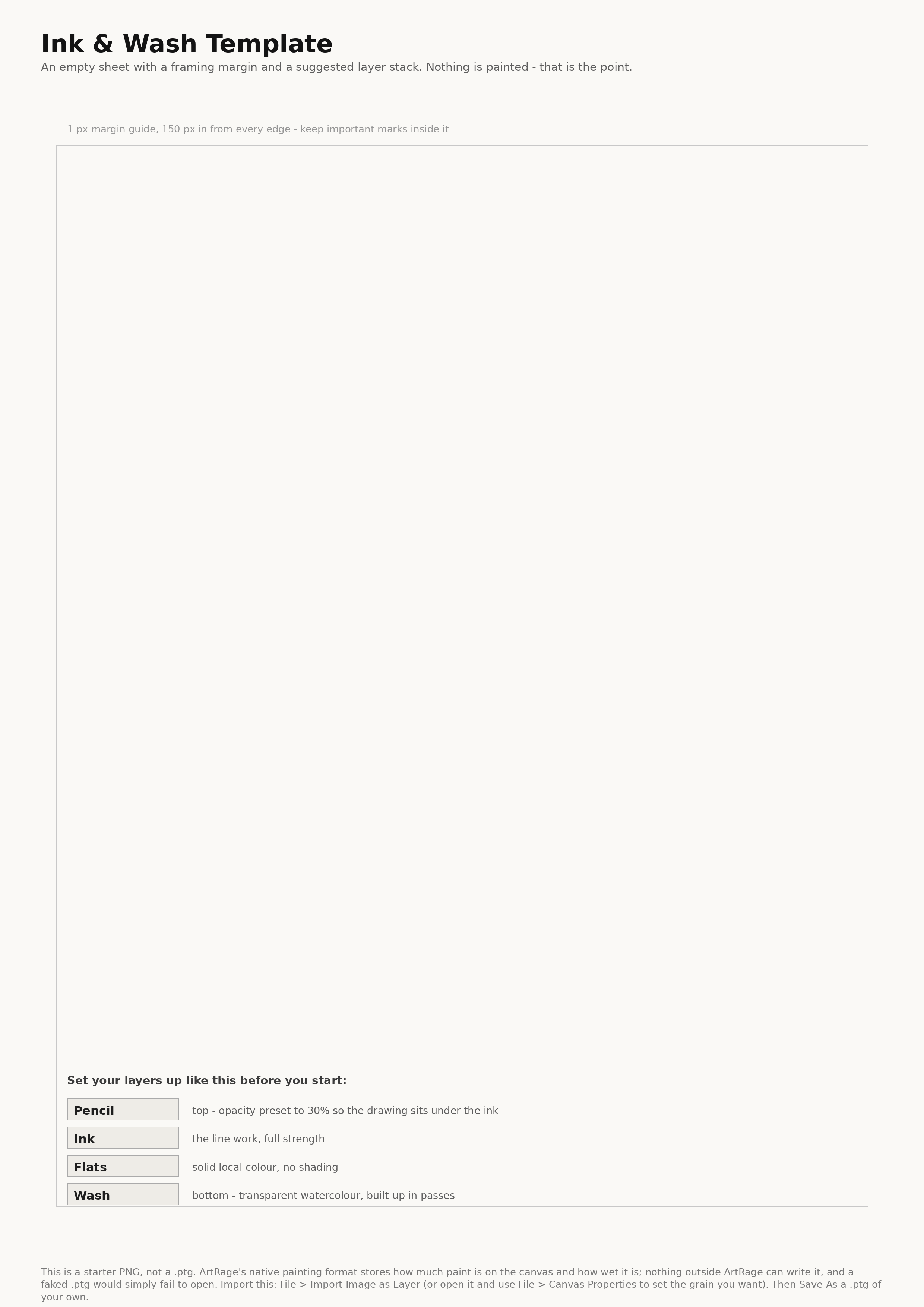
An empty ArtRage 6 painting, 2480 x 3508 px, set to a medium canvas grain. Four empty layers, bottom to top: 'Wash', 'Flats', 'Ink', 'Pencil'. The 'Pencil' layer's opacity is preset to 30 per cent. No paint on any layer. A fifth locked layer at the bottom named 'Margin' carries a 1 px #C8C8C8 rectangle inset 150 px from every edge as a framing guide. Same reason. Shipped as the 2480x3508 300 DPI template PNG with the 150 px margin guide and the recommended four-layer stack printed on it.
Watercolour Wash Collection
An ArtRage colour sample collection (.col) of 16 samples chosen to stay readable when laid transparently over one another: four warm lights (H45 S25 B95, H35 S35 B88, H20 S40 B82, H10 S45 B75), four cool lights (H190 S20 B92, H205 S30 B85, H215 S35 B78, H230 S35 B70), four warm darks (H25 S55 B48, H15 S60 B38, H30 S45 B30, H10 S50 B22) and four cool darks (H210 S50 B45, H220 S55 B34, H235 S50 B26, H245 S45 B18). Each sample named with its H, S and B values. Same reason as L22: .col is undocumented. Sixteen colours shipped as a sampleable chart PNG plus round-trip-verified .aco and .ase.
CHECK YOURSELF
Can you answer these?
Answer out loud first, then open each one to compare.
Can you predict how a pencil stroke will change if you switch from a fine to a coarse canvas grain?
It will break up. A dry mark lands where the tool touches the raised parts of the tooth and skips where the surface dips, so a coarse grain gives you a broken, gritty line and a fine grain a smooth, dense one — with nothing about the tool having changed. That is why the first decision in a drawing-led piece is which canvas to draw on rather than which pencil to use. Watercolour uses the same surface the other way round: thin colour runs into the grain and settles in the low points, so a wash looks granular on coarse canvas and even on smooth.
Can you get a visibly different mark out of the pencil by tilting the pen instead of pressing harder?
This is a doing check. Lay the pen over toward the canvas instead of holding it upright and draw — your X4 reports up to 60 degrees of tilt, so the mark should broaden and soften without you pressing any harder. It is the digital equivalent of using the side of the lead rather than the point, and it is how you shade an area quickly instead of hatching every millimetre of it. Pressure is the other axis, with 16,384 levels: light for construction lines, heavy for the lines you mean. Test them separately on a scrap canvas — one change, one test stroke, look.
Can you ink a drawing so that every shape you want to fill is fully closed?
The check is practical: zoom in on every join before you fill anything, because the Fill tool only stays inside a shape that is genuinely closed. If a fill leaks out into the background you have a gap in your line, and the fix is to find it and close it rather than to fight the fill settings. Ink on its own layer with the pencil drawing underneath at reduced opacity, keep the flats on a layer beneath the ink so the line stays crisp, and vary line weight while you are at it — thicker on the shadow side and the outer silhouette, thinner inside the form and on lit edges.
Can you explain why the lightest value in a watercolour should usually be untouched canvas?
Because watercolour is transparent and works in passes: every wash lets the one underneath show through, so colour only ever builds up and never lightens. The canvas itself is the lightest value available, which means your lights have to be planned as areas you simply leave alone rather than painted in later. Paint white over a wash and it reads as an opaque patch sitting on top rather than as light, which is exactly what gives away a watercolour done in the wrong order. Work light to dark and let a wash settle before you cross it, or the two will bleed together — which is either the best thing about the medium or a mess, depending on whether you meant it.
Go deeper
ArtRage 4 PDF manual - the most readable single document, still around 90% applicable
https://www.artrage.com/wp-content/uploads/ArtRage-4-Manual.pdf
← Previous
Oils, Palette Knife & Blending
Next →
Stencils, Tracing, References & the Custom Brush