
LESSON 16 · VALUE & LIGHT
Rendering Form
Rendering is the controlled journey from a flat block-in to a finished form, and the thing that controls it is edges. This lesson gives you a repeatable order of operations, explains what makes an edge hard, soft or lost, and shows you how to blend by choosing values rather than by smudging pixels around.
60 min
TIME
Advanced
LEVEL
Photoshop or ArtRage
SOFTWARE
What you'll learn
Work through a block-in in a fixed order, big shapes to small
Separate local value from the effect of light
Choose hard, soft and lost edges deliberately
Direct the viewer's eye using edge contrast rather than detail
Blend by laying in intermediate values instead of smudging
Clip and lock layers so paint stays inside the silhouette
Before you start
Finish first: L14, L15
- Your finished L15 worksheet, or one simple object under one lamp
- An opaque round brush with pressure mapped to opacity
- A blank 2500x2000 canvas
WATCH
Watch this first
Understanding Layers in Photoshop - Day 4
PHLEARN — Teaches the layer stack, blending modes and non-destructive editing on a current Photoshop build - the mechanics the 2021 Marco Bucci demo relies on.
Let's Improve Our Brushwork
Marco Bucci — Directly addresses the soft-brush habit that ruins most beginner digital rendering.
THE LESSON
An order of operations you do not deviate from
Rendering goes wrong when it happens in the wrong order. The universal beginner failure is to pick one eye, or one corner, and finish it completely while the rest of the drawing is empty. By the time the rest catches up, that finished corner is wrong - you decided its values before you knew what they relate to.
The order that works is always large to small. First the silhouette: one flat shape, correct in proportion and gesture, nothing inside it. Second the two families from Lesson 15, still completely flat. Third local value, the object's own lightness where it differs from its neighbours. Fourth the planes, the halftones stepping the form round. Fifth edges. Last, and only last, the accents: the highlight, the occlusion shadow, and two or three small details that cost nothing because the structure is already right.
At every stage, the whole picture should be at the same level of finish. If you can zoom out at any moment and see a complete, if crude, image, you are doing it correctly.
Local value versus light
Local value is how light or dark a thing is in itself, ignoring the lighting. Paper is light. Coal is dark. That is local value.
Here is where beginner paintings usually break. A white mug standing in shadow can genuinely be darker than a black mug in direct light: the lighting condition is often a bigger factor than the object's own colour. So when assigning values, ask two questions in order - which family is this in, and only then, is this object light or dark for its family?
Getting that order backwards produces the classic flat picture where every white object is pale and every dark object is dark regardless of where the light is falling. Family first, local value second. That principle comes back in full force in Module 5 when local colour meets the colour of the light.
Edges: hard, soft, lost
Edges are the most under-taught and most powerful control you have. There are three kinds and each one has causes you can reason about.
A hard edge happens at a plane break, at an overlap where one object passes in front of another, at the boundary of a cast shadow near its contact point, and wherever a material genuinely has a crisp boundary. Hard edges pull the eye. They read as near, as sharp, as in focus.
A soft edge happens where a surface turns gradually, where the light source is large and diffuse, where an object is out of focus because it is far away or very close, and where something is moving. Soft edges recede and calm an area down.
A lost edge happens when two adjacent areas arrive at the same value and the boundary simply disappears - a dark shoulder against a dark background. Beginners never use this deliberately, and it is the difference between a painting and a colouring book. The viewer's brain rebuilds the missing edge and enjoys doing it, which is why a drawing with every shape fully outlined feels stiff.
Put those three together and you have a focus system. Your hardest edges and strongest value contrast go where you want the viewer to look; everywhere else gets softer and lower in contrast. Detail does not create focus - contrast and edges do, and detail placed elsewhere is just noise.
Blending without smudging
There is a right and a wrong way to make a soft transition digitally. The wrong way is a soft airbrush at 15 percent opacity, scrubbed back and forth until the boundary goes away. It works, technically, and produces a soft grey haze with no structure in it - the most recognisable marker of an inexperienced digital painting.
The right way is to blend by value selection. Pick a value halfway between the two you want to join, lay it down as a shape along the boundary with an opaque brush, then pick a value halfway between that one and its neighbour, and repeat. Three steps will read as a smooth transition from a normal viewing distance, and unlike an airbrushed gradient, it still has structure and brushwork in it.
Set your brush up for it: an opaque round with pressure controlling opacity, and the flow kept high. ArtRage takes a different but equally valid path - its natural media tools genuinely mix paint, so the Blending tool and the Palette Knife physically smear and scrape wet paint rather than faking a gradient. That is real paint behaviour, not a low-opacity haze.
The layer stack that keeps you out of trouble
Build a stack rather than painting on one layer. Bottom: background. Above it: the silhouette as one flat filled shape. Above that: a rendering layer clipped to the silhouette - Alt-click or Option-click the line between the two layers in Photoshop, or use Layer > Create Clipping Mask. Every stroke on the rendering layer is now confined to the object, so you can be fast and messy at the edges.
Lock transparent pixels on the silhouette layer if you would rather repaint it directly. Keep cast shadows on their own layer so they stay editable, and put the highlight and occlusion accents on a top layer so you can knock them back if they get loud.
One caution: layers are for protecting decisions, not for avoiding them. If your file has forty layers you are probably deferring judgement rather than making it. Three or four is usually plenty at this stage.
Save the stages
Save a flattened copy at the end of each stage - silhouette, two families, planes, edges, accents. Five images. When a painting goes wrong you will almost always be able to point at the exact stage where it did, and that is worth more than the finished piece.
PRACTICE · 45 MIN
One object, five saved stages
- Choose one object with both curved and flat surfaces - a shoe, a mug with a handle, or a folded cloth over a box. One lamp only.
- Stage 1: paint the silhouette as one flat mid value. Check proportion by flipping the canvas horizontally. Save a copy.
- Stage 2: on a clipped layer, fill the shadow family flat with one value. No gradients at all. Save a copy.
- Stage 3: adjust for local value - any part of the object that is genuinely lighter or darker than the rest gets stepped, staying inside its family. Save a copy.
- Stage 4: add halftones, stepping the light family round the form. Blend only by picking intermediate values, never with a soft airbrush. Save a copy.
- Stage 5: go through the whole object and make a deliberate decision at every boundary - hard, soft, or lost. Give yourself at least one genuinely lost edge. Save a copy.
- Add accents last: the highlight, the occlusion shadow, no more than three small details.
- Line the five saved stages up side by side and look at where the drawing was strongest.
Done when: Five saved stage images plus a finished render containing at least one hard, one soft and one lost edge that you can point to and justify.
Practice files
Download these and work along with the lesson.
Block-in to Finish, Five Stages
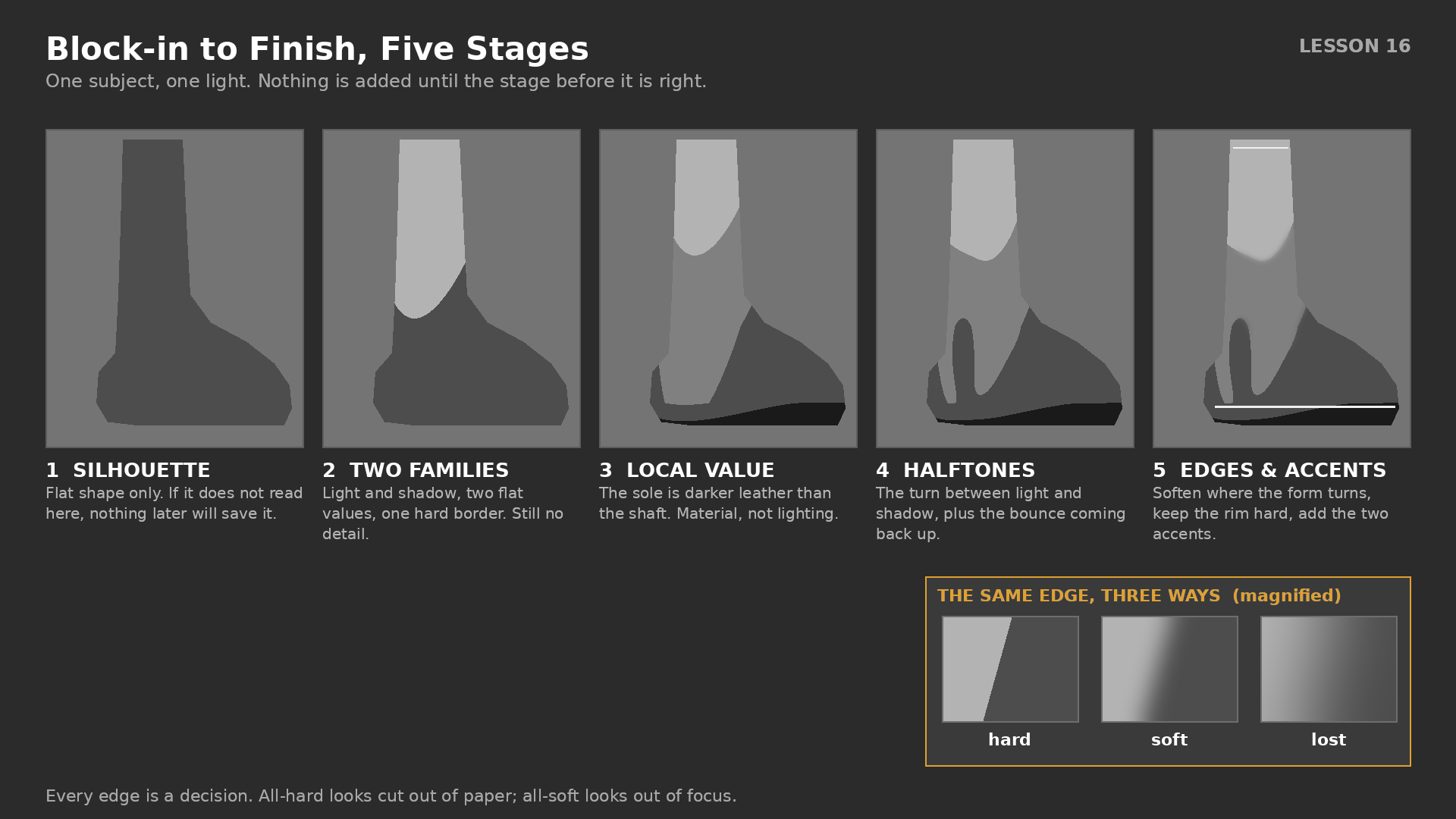
1920x1080 PNG, #2B2B2B background. One subject - a leather boot lit from the upper left - shown five times across the frame at 340 px wide each: flat silhouette, two flat value families, local value adjusted, halftones added, edges and accents resolved. Numbered captions 1 to 5 in 26 px white beneath each, with a one-line description of what changed. A magnified inset in the lower right shows the same edge rendered three ways, labelled hard, soft and lost.
Edge Control Drill
2500x2000 px PSD, 300 dpi. BACKGROUND #808080 locked. Locked layer SHAPES containing nine flat dark shapes in a 3x3 grid - three spheres, three cubes, three draped cloth forms - each already filled at value 4 with no rendering. Above it three empty layers named HARD, SOFT and LOST, so the student renders the same nine shapes three times, once per edge treatment. Five-value swatch strip embedded along the bottom on a locked layer. Each grid cell labelled with the intended light direction as a small arrow.
CHECK YOURSELF
Can you answer these?
Answer out loud first, then open each one to compare.
Can you state the five stages of a block-in in order and say what belongs in each?
Silhouette, the two families, local value, planes, edges — then accents last. The silhouette is one flat shape with nothing inside it, correct in proportion and gesture. The two families from Lesson 15 go in completely flat, light against shadow with no gradients. Local value steps any part of the object that is genuinely lighter or darker than the rest, staying inside its family. Planes are the halftones taking the form round, edges are a deliberate hard, soft or lost decision at every boundary, and the accents — highlight, occlusion shadow, two or three details — cost nothing because the structure is already right. The test that you are following it is that the whole picture is at the same level of finish at every moment.
Can you explain how a white object can be darker than a black one in the same picture?
Because the lighting condition is often a bigger factor than the object's own colour. A white mug standing in shadow can genuinely be darker than a black mug in direct light — the white one is in the shadow family, and nothing in the shadow family may be as light as anything in the light family. That is why you ask the two questions in order: which family is this in, and only then, is this object light or dark for its family. Get the order backwards and you produce the classic flat picture where every white object is pale and every dark object is dark wherever the light happens to be falling.
Can you name the three edge types and one physical cause of each?
Hard edges come from a plane break, an overlap where one object passes in front of another, a cast shadow near its contact point, or a material with a genuinely crisp boundary — they pull the eye and read as near and in focus. Soft edges come from a surface turning gradually, a large diffuse light source, something out of focus because it is far away or very close, or movement. Lost edges happen where two adjacent areas arrive at the same value and the boundary simply disappears, like a dark shoulder against a dark background. Used together they are a focus system: hardest edges and strongest contrast where you want the viewer to look, softer and lower contrast everywhere else.
Can you make a smooth transition without touching a soft airbrush or a smudge tool?
Blend by value selection rather than by smudging. Pick a value halfway between the two you want to join and lay it in as a shape along the boundary with an opaque brush, then pick a value halfway between that one and its neighbour and repeat — three steps read as a smooth transition from a normal viewing distance, and unlike an airbrushed gradient they keep structure and brushwork. Set the brush up for it: opaque round, pressure controlling opacity, flow high. ArtRage takes a different but equally valid route, because the Blending tool and the Palette Knife genuinely smear and scrape wet paint rather than faking a gradient. The thing to avoid is a soft airbrush at 15 percent scrubbed back and forth, which leaves a grey haze with no structure in it.
Go deeper
Ctrl+Paint library
https://www.ctrlpaint.com/library
Winged Canvas digital art resources
https://www.wingedcanvas.com/digital-art-resources
ArtRage online manual
https://www.artrage.com/manuals/
← Previous
Form Shadow vs Cast Shadow
Next →
Value Composition & Thumbnails